Enterprise UI Design Systems and Platform Updates: What Teams Need to Know Before the Next OS Release
Enterprise UI teams rarely think about platform risk until a major operating system update changes the rules underneath them. Controls that worked reliably now behave unpredictably. Visual conventions users had learned over years shift without warning. Design specifications written against one platform version no longer describe what users actually see.
Platform changes are a recurring design and delivery risk that most enterprise teams are underprepared for — not because they lack design capability, but because they lack a shared framework for thinking about UI elements precisely and evaluating platform dependencies before they create problems.
Two practices address this directly: building shared, precise literacy around UI components so that design, development, and product teams describe the same things the same way; and treating platform visual language updates as a UX risk that requires structured evaluation, not passive acceptance.
Why UI Component Naming Matters in Enterprise Design Systems
The Hidden Cost of Inconsistent UI Terminology
Most design and development teams use the same terms to mean different things. A developer calls it a dropdown. The designer calls it a picker. The product owner's specification says menu. Each person has a different element in mind, and none of them have confirmed whether the others share that understanding.
That imprecision surfaces in design handoff as components built to the wrong specification. It shows up in usability sessions as inconsistent interaction patterns. It creates friction in design system documentation where the same element carries three different names. Shared UI element vocabulary is a coordination mechanism that reduces rework, shortens review cycles, and keeps design intent intact from specification through delivery.
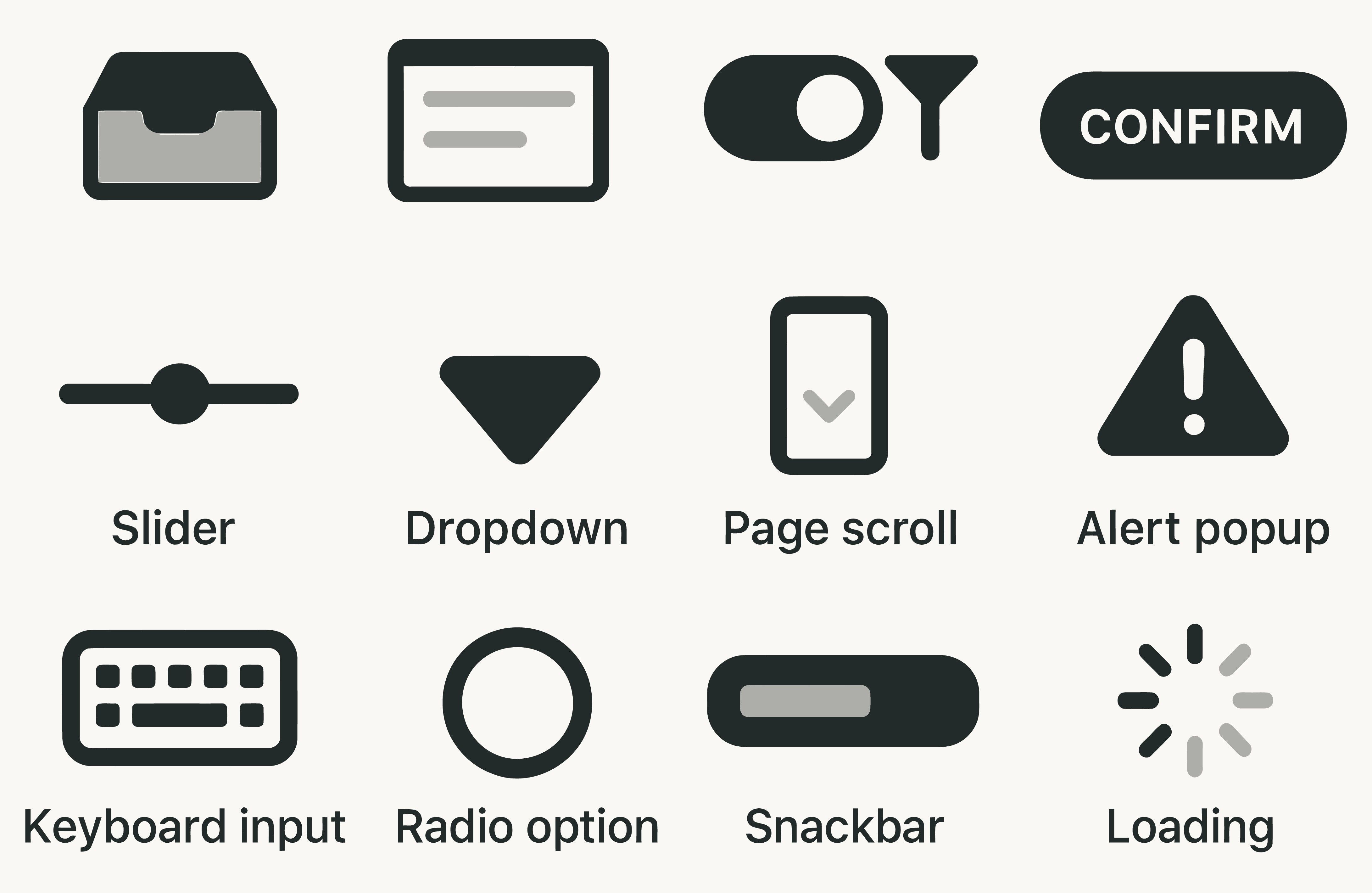
UI Components Enterprise Teams Commonly Confuse
Enterprise interfaces concentrate on a small set of components. These are the elements where naming precision pays off most directly.
-
Input controls cover every mechanism through which users enter data: textboxes, checkboxes, radio buttons, toggles, sliders, and pickers. The distinction between a dropdown list — single selection from a collapsed list — and a listbox — which displays all options simultaneously and supports single or multi-select — matters because they behave differently, communicate different affordances, and carry different interaction costs.
-
Overlays cover dialogs, popups, lightboxes, and bottom sheets — terms used interchangeably in most teams. A dialog is modal: it blocks interaction with underlying content until dismissed. A popup is a non-fullscreen overlay. A snackbar is transient and non-modal, disappearing without user action. Each has a specific interaction model, and the wrong one in a specification produces the wrong component in delivery.
-
Navigation elements — navigation bars, drawer menus, tab bars, breadcrumbs — define how users move through a system. In enterprise applications, navigation is where cognitive load accumulates. The distinction between a tab bar, which switches between panels of content, and a navigation bar, which provides access to categories within an information architecture, shapes how users build a mental model of the product over time.
-
Progress indicators — spinners, progress bars, and skeleton screens — serve different user needs. A spinner signals an ongoing process with no duration estimate. A progress bar shows advancement toward completion. A skeleton screen pre-renders the page layout during loading. Deploying a spinner where a skeleton screen is appropriate is a small decision with a measurable effect on perceived performance.
How to Align a Team Around Element Definitions
1. Establish a shared component reference. A single, accessible document — within a design system or component library — that names each element, defines its interaction model, and shows a visual example. Start with the ten elements that appear most often in the product.
2. Align naming in specifications and handoff notes. Component names in design specifications should match the shared reference. Inconsistency between design and development vocabulary is a source of delivery errors that is entirely avoidable.
3. Include interaction model descriptions, not just names. A label on a component diagram is not enough. What state does it appear in by default? What happens when activated? Precision at this level prevents rebuilds after the first review cycle.
What Platform Design Language Changes Mean for Enterprise UX
When an Operating System Update Becomes a Usability Risk
Enterprise mobile applications built for iOS do not exist in isolation. They depend on the platform's visual conventions, interaction patterns, and component behaviors. When the platform changes how those elements look and behave, the enterprise application inherits the change — whether or not it was designed for it.
Apple’s iOS 26 update introduced Liquid Glass, a translucent visual design language that changes how controls, navigation, and overlays behave across Apple interfaces. The core usability issues are not aesthetic. They are structural.
Legibility under translucency. When interface elements become partially transparent, content behind them degrades their readability. Controls placed over dynamic, image-heavy content — standard in enterprise dashboards and content management tools — become harder to read when the background bleeds through. Reduced contrast between foreground and background can make text and controls harder to scan, especially in dense enterprise workflows.
Animation without functional meaning. Controls that animate decoratively create persistent low-level distraction. The eye detects motion as a signal of change or priority. When animation is decorative rather than informative, that signal becomes noise. In enterprise applications where users move through the same flows dozens of times per day, decorative motion compounds into cognitive friction.
Inconsistent tap target size and placement. Navigation controls crowded by additional elements or reduced in size increase error rates for common actions. For enterprise users completing high-frequency, time-sensitive workflows, an increase in tap errors is a productivity cost with a measurable effect on task completion time.
Unpredictable control behavior. Controls that appear, collapse, or relocate depending on system state require users to rescan the interface on every interaction rather than relying on learned habit. Enterprise efficiency depends on users completing tasks without deliberate attention to the interface.
How Enterprise Teams Should Prepare for Platform UI Updates
Platform visual language updates are not events to react to after release. They are a known category of design risk that can be evaluated in advance.
1. Identify Platform-Dependent UI Components Before They Break Know which elements in your product inherit visual behavior from the underlying platform — tab bars, navigation controls, overlays, and input fields are common examples.
2. Use Heuristic Evaluation to Review OS-Level Design Changes When a major OS update is announced, run a focused review of platform-dependent components. Evaluate against legibility, contrast, tap target size, and predictability of control behavior.
3. Test Platform Updates With Representative Enterprise Users A small moderated usability session with representative users can surface friction that expert review alone may miss. Platform updates change behavior in ways that only real task context reveals.
4. Document Platform-Driven UI Changes in the Design System A brief note in the design system — "iOS update affected tab bar spacing; reviewed in June" — creates continuity and prevents the same problem from being re-discovered in the next cycle.
Enterprise UI Platform Checklist
Before releasing an interface update that builds on or inherits platform components:
- Does the design system use consistent, defined names for every component referenced in specifications?
- Have platform-dependent elements been identified and listed separately from custom-built components?
- Has legibility been evaluated under the platform's current visual language — including contrast under any translucency effects?
- Have tap targets been checked against the minimum size and spacing guidelines relevant to the platform?
- Has any recent platform update been reviewed for interaction or visual changes that affect the product's navigation or input patterns?
- Have at least five representative users completed a realistic task on the current platform version?
FAQ: Enterprise UI Components, Design Systems, and Platform Updates
1. Why does consistent UI element naming matter in enterprise delivery?
Inconsistent naming creates specification gaps between design and development. When a designer writes "dropdown" and a developer builds a different component, the error surfaces at review — often too late for a low-cost fix. A shared element vocabulary eliminates a category of rework that is entirely avoidable.
2. How should enterprise teams handle a major platform update that affects their mobile interface?
Treat it as a structured UX event. Identify which components inherit platform behavior. Run a focused heuristic evaluation against the updated platform. Test with representative users on realistic tasks before deployment. Document changes to platform-dependent components for future reference.
3. What is the practical risk of translucent or animated UI elements in enterprise applications?
Translucency reduces contrast between controls and dynamic backgrounds, making text and icons harder to read under the conditions enterprise applications are typically used — variable lighting and high-frequency task repetition. Excessive animation creates persistent distraction that compounds over hundreds of daily interactions.
4. How often should enterprise design teams audit platform-dependent UI components?
At minimum, once per major platform release cycle. For products with significant mobile usage, a lightweight component review aligned to operating system update schedules — typically annually for major releases — identifies platform-driven regressions before users report them.

10 Enterprise Technology Trends in 2026: A Tarento Guide for CTOs and Software Architects